Assignment 3-4 (don't ask)
This had a really weird prompt - we had to create a "self-representation" that combined items that had some importance to us, creating a bizzare creature/character/person that represented our interests. Uh... riiiiiight. We then had to create a simple setting out of additional objects, place the character into that setting, and produce a final rendered output.
After a few false starts (I really hate out-there "artsy" prompts like this), I eventually created this image:
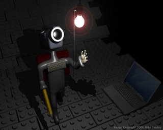
In case you can't tell, the objects included are: video camera, book (on back), keyboard, laptop, LEGOs, pencil (art), light bulb (creativity)... and the hand I made earlier in the semester because I didn't know what to put for the guy's left hand. The hardest part of this project was getting the skelton to work. This was the first character I'd made from a solid mesh, with controlling "bones" inside that would deform the mesh in a "natural" way. Problem was: bones are stupid, and don't know what parts of the body they should affect. I would move the right arm, and half of the right side of the torso would come with it! This project also took waaaay to long to render, as I foolishly modeled the actual raised "LEGO" text on the blocks. I only did it once, then copy/pasted the rest, but the final result added up to a lot of polygons.
Assignment 5
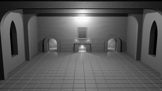
This was a lot of fun. We were supposed to create a scene in which every object was the default "light gray" color. Everything interesting had to be done with geometry, bump maps, and lighting. Since the 3 final renders were to be in black and white, we were told to create 3 distinct, interesting lighting setups. I made a castle/mansion-y interior with a fireplace and whatnot. My first render was a somewhat boring overview of the room lit from various places:
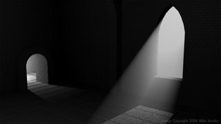
My second render got a bit more interesting, and I played with the volumetric effects Lightwave has (about 1000x more flexible and better-looking than TrueSpace's):
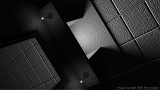
Finally, I decided to try a fairly radical angle with dramatic lighting from the fireplace (turn your head to the left if you don't see it immediatly):
I really enjoyed this assignment, although in retrospect theyre are a lot of things I would have done a little differently, and I never had time to do some of the cool things I planned (chandeliers and such).
Assignment 6 (current project)
We pretty much jsut started this one, so I'm nowhere near finished yet. We're supposed to "...recreate a past environment, room, or space that you associate with." This environment doesn't have to depict a real place, but the final image should "tell a story." The depiction can be abstract, surreal, impressionistic, emotional, or realistic. (Obviously, I chose realism - I want to do CG for my movies, not "explore the human condition" or somesuch) Yeah, this is another wacky "artsy" assignment, but it's vague enough that I can do just about anything and justify it. I chose to depict a landcape scene, with the story being someone who is camping. (for Halapy: I'm basically re-arranging parts of the land around the lake at Heritage, with a few "artistic liscence" additions of my own).
I still have a long way to go, but as of tonight I've made a lot of progress on the grassy hill where the campsite will be (using Lightwave's SasLite hair plugin to make the grass), a pretty decent tree, and a broken-down stone wall. (Why is there a stone wall on this hill? - Because it looks cool there.) Anyway, here's my W.I.P. shot:
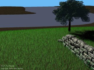
Obviously, everything beyond the hill in the foreground is still at a very rough stage. At one point, I tried covering the entire terrain with the simulated grass, but I ran into an internal limit with the SasLite plugin (they have to give you some incentive to pay money for the full version of "Sasquatch"). In light of this, I'm now using the SasLite grass just for the hill, and will find a simple grassy texture map for the rest of the land, since it's too far away to tell the difference anyway.
I also still need to do the water properly, clone that tree about a million times, and add the campfire. All of this while trying to finish my final Writing 205 project, and catching up on play reviews for my two drama classes. This next week should prove interesting...
3 comments:
Wow, some really nice pics there!
Holy shit, those look amazing.
Thanks! Which ones in particular do you guys really like? Crits are always appreciated. :)
Post a Comment